As you have read in the previous posts the PPG signal is basically the same principle as palpitating the pulse at the arteria radialis. However, instead of putting your finger on your wrist, with FibriCheck you are putting your smartphone on your finger! FibriCheck will record the pulse rhythm for a duration of 60 seconds and process those results for rhythm interpretation. In this post we will guide you through the different ways FibriCheck is visualizing these rhyhtms and how you can interpret and validate them. We will discuss the most common rhythms and highlight some relevant cases.
Our Algo-Rhythms are constantly learning by itself, you determine how fast!
The visualisation used for FibriCheck measurements
FibriCheck will use a 3-graph visualisation for a quick glancing impression. These graphs are shown in the figure below.
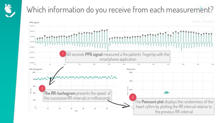
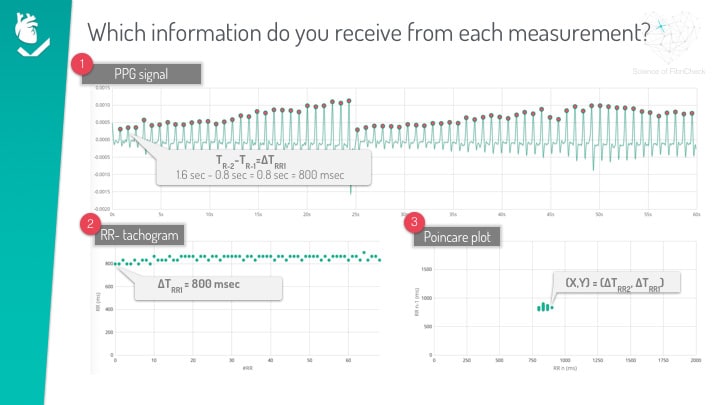
Graph 1: The 60-second PPG signal: This signal represents the 60 seconds of PPG signal where each peak indicates a heartbeat. When this graphs shows 60 peaks, the heart rate is 60. When this graphs shows 80 peaks, the heart rate is 80. At each peak a red dot is visible, this is the peak detection algorithms from FibriCheck. By detecting these peaks it is possible to determine the exact location of the heartbeat. In the graph below the first two peaks are identified as TR-1 and TR-2 . Calculating the distance between these peaks by substracting their time-component TR-2 and TR-1 results in the RR-interval. In this particular case the TR-2 – TR-1 = ∆TRR1 this equals to 1.6 sec – 0.8 sec = 0.8 sec or 800 msec. This means that the RR-interval (∆TRR1) between the first two peaks equals 800 msec or 75 bpm. Additionally, the PPG signal also shows insight in the quality of the signal. If a signal has clear distinguishable peaks, the quality of the signal is good. Is the signal noisy, with erratic peaks, the quality is low and the system will label it with a blue color.
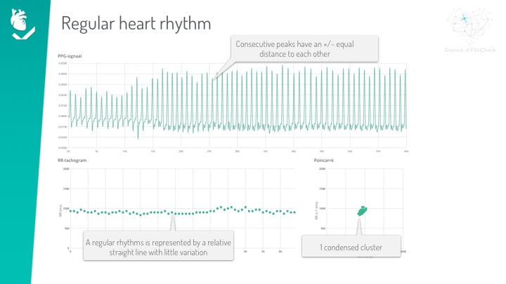
Graph 2: The RR-tachogram: The tachogram respresents the duration of each RR-interval. By plotting the index of each calculated RR-interval on the x-axis and the value on the y-axis. For the example described above, where the first RR-interval is 800 msec, the first point on the tachogram is the 800 msec interval and for each consecutive RR-interval it is possible to read the corresponding rate. The tachgram provides the time-resolved information using the beat-to-beat interval variability and can help identify different arrhythmia’s as will be shown below. For a regular rhythm case, as shown in the figure, a straight line indicates a rhythm with low heart rate variability.
Graph 3: The RR-poincarré: The poincarré or RR-cluster plot is a cluster based representation of the rhythm and enables a quick insight in the type of arrhythmia based on very specific cluster patterns. For a normal regular rhythm, as shown below, the points are located in a central condensed cluster. The poincarré is constructed by plotting the ∆RR1 interval versus the ∆RRn-1 interval. This means that if variability occurs, this results different cluster patterns.
Case 1: A regular rhythm
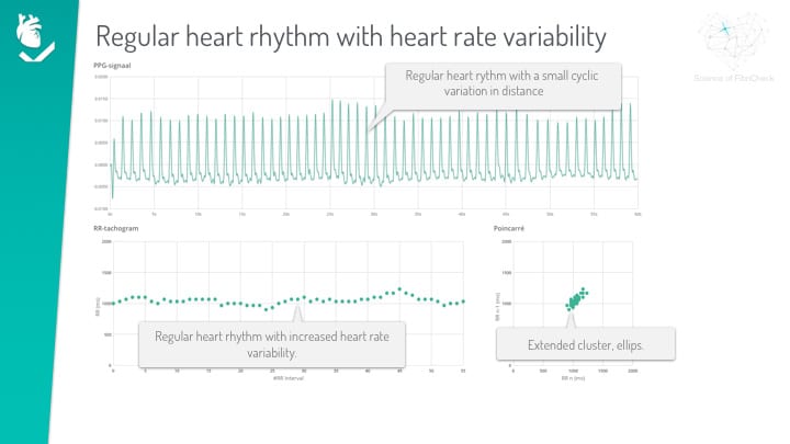
Case 2: A regular rhythm with increased heart rate variability
Case 3: A regular rhythm with frequent extra systoles
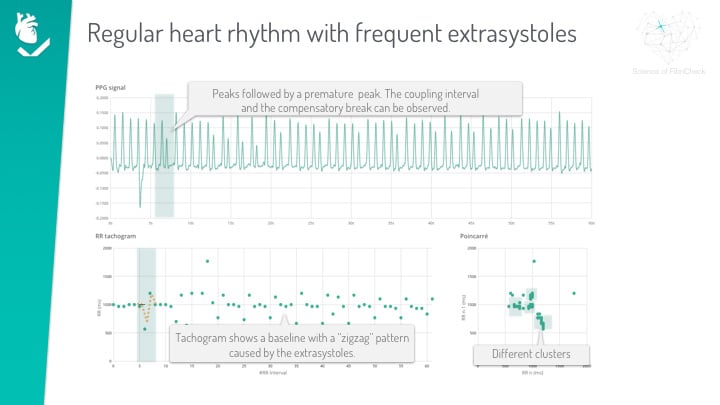
Case 4: A regular rhythm with brady episodes
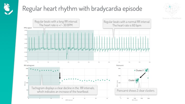
Case 5: A regular rhythm with tachy episodes
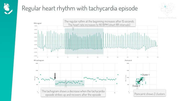
Case 6: Atrial Fibrillation
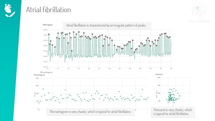
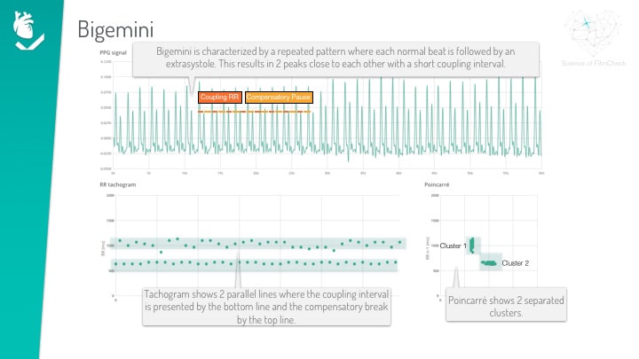
Case 7: Bigiminy
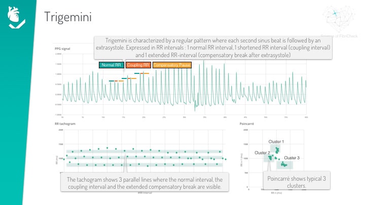
Case 8: Trigiminy
Created on juni 23rd, 2019 at 12:53 pm
Last updated on maart 30th, 2023 at 12:06 pm


